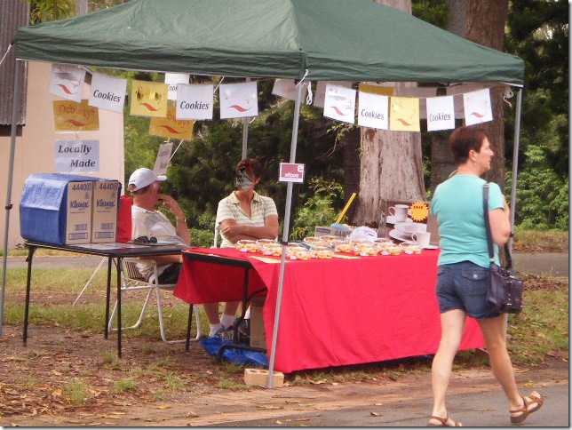
Go to any market and a lot of the stall holders will have set up their display like this. I have airbrushed their faces and identifying signs to protect the inexperienced.

Another reason I don’t particularly like this set up is that the table has created a barrier between you and the customers. Its very difficult for you to get around and provide assistance, to make the experience personal for them, to engage with the customer.
The product is well packaged but displayed poorly. Having all your products sitting flat on the table provides no visual stimulus, there is nothing to catch the eye. The food is also directly in the sun.
If you have no choice due to site position then you need have an attention getter, something that will stop people in their tracks for a better look. That few seconds pause in their step could be all that is between you and a sale.
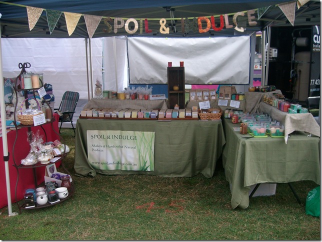
Not all sites and conditions are equal so your set up strategy will need to be flexible. Sue from Spoil & Indulge has mastered this.
Note that Sue has set up the site to entice the customer in. The placement of the 4 tiered stand catches the customers eye inviting them in a little further. The L-shape with the short end at the entrance is another successful ploy.


Setting up your site is akin to setting up a shop. Large Department Stores, Boutiques etc spend a lot of time & effort on Visual Merchandising. Why? because it increases their sales. Have a look around the next time you are a market at how more experienced stallholders set up their sites. Experiment and note how changes affect your sales. You’re not likely to get it right first time but with a little perseverance you will learn the best setup for you and your product.

1 comment:
great tips! I've done a few booths & it is tricky business setting up. Thanks for the tips. =)
Post a Comment